HelloFresh Special occasion boxes | Case study
Background
HelloFresh wanted to create a reusable design framework to sell various special food boxes for occasions such as Christmas, Mother’s day, BBQ parties. These boxes are offered as one-off offerings—in contrast to HelloFresh’s main subscription business model; yet we still had use the main HelloFresh digital platforms to sell these boxes. To launch this new category of products, it was decided that we will build an MVP and continually improve the product along the way. This also meant we had to keep research and design process minimal and fast-paced.
Outcome and success metric
HelloFresh was able to launch 3 different products—Christmas Box, Mother’s Day Box, and Grilling Box across various markets using the same framework with digital launch of each box taking as little as just under a week. The main success metric for this project was conversion rate, which was 89%, 73%, and 81% respectively for the aforementioned offerings.
My role
As a product designer for this project, my role involved requirements gathering, stakeholder management, and developing, designing and testing the concept. And finally, working alongside engineers in an agile work environment to ship the product.
Phase 1 - Research and scoping
Gathering requirements and knowledge residing within different teams
Special occasions boxes were launched on a trial basis in one of the HelloFresh’s markets. Hence multiple teams such as, Business Innovations, Marketing, Culinary, Product Development, and Tech had learnings and insights about the product. To gather the learnings that resided within the team and to benefit from it, we conducted a workshop, where participants from different teams came together and mapped pain-points and opportunities at key moments in user journey from discovery to ordering to cooking food to sharing feedback.


Outcome of the workshop
As the outcome of this activity, we had a list of existing features that needed to be improved and also new ones to be introduced to the digital experience. We then ranked the priority of these features through voting system based on how critical they were to the success of the MVP. This helped us scope the project for the first launch.
Phase 2 - Design
Based on the defined scope of work, it was decided on to create a reusable webpage framework that would be easily customisable with minimal development work for each new product launch. This also meant to maintain a certain format the way products are packaged and offered.
We also looked at previous studies conducted for our main product; we specifically focused on learning that indicated what sort of information helps drive buying intent. We then combined these two to create an overarching structure that could be used for seasonal box landing page.
The next stage in the design phase was to utilise learnings from our main product and ideas gathered from ideation workshop. For this we got some designers, PO, engineers, and other stakeholders together in a room for a sketch workshop. The main intent of the activity was to define the structure of the landing page.
Based on the sketches generated, we finalised the information structure of the landing page as follows—
- Product Category information
- How it works
- Individual product type details + Main CTA
- Additional info about the product
- FAQs
Initial digital wireframes
I explored two different design approaches for the landing page design—
a. A single page that combines the category information as well as the individual product details
b. With 2 page flow, where there would be a separate product details page

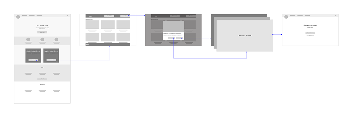
First-click test
To determine which of these to move ahead with we ran a First Click test. Due to quick implementation timelines, we conducted this test in-house involving HelloFresh employees outside the tech department who are HelloFresh users. The results of the test indicated the hybrid version (landing + PDP) was the clear winner.
UI Design
After we established the content hierarchy and user flow for the experience, I started wotking on the final UI for the landing page. In this phase we were faced by some unique challenges such as—
- Guiding users to products that sat below the screen fold
- Making product tabs / toggle obvious to ensure users don’t miss them
- Ensure users can easily find the main CTA to buy the product on the long-scroll page


Analysis and Next Steps
Some of the key findings emerged as we monitored the performance of the product—
Users spent a long time inspecting the landing page (on average 2 mins 37 sec.) before dropping off
Next steps
- Conduct usability test to understand why users spend such a long time on the page
- Redesign experience to customise boxes with features like Add-ons, multiple quantities of the same box, etc.
- Allow designs to accommodate more than one special box to be live simultaneously
- Refine easier checkout funnel for special boxes (currently it uses the checkout funnel of the main product)
- Refine the post-purchase experience

